
Animation I created showing the process involved in creating my Christmas card design and wishing clients, and the online community Season's Greetings.

Back in November, with my annual Christmas card deadline looming and no idea what my theme would be as yet, I happened to catch a documentary on ABC called Finding The Field: https://iview.abc.net.au/show/finding-the-field
Like a love letter to Australia’s colour field art movement and the process NGV curators Beckett Rozentals (Australian Painting, Sculpture and Decorative Arts) and Jane Devery (Contemporary Art) went through, in collaboration with surviving artists, to restage the NGV’s 1968 inaugural exhibition, The Field, for it’s 50th anniversary earlier this year.
Fab insights into Australia’s art scene in the 1960s, geographically isolated but spontaneously breaking away from more traditional, figurative art – part of the global response to the political and social climate of the day – and forging a new creative process, philosophy and aesthetic all our own.
The forms, patterns, surfaces and colours are startling now – let alone for a 1960s market and public accustomed to more traditional painting and sculpture – and happily provided the inspiration and creative stimulation I needed.
Works from the exhibition that I particularly loved (bottom L to R)
1. Janet Dawson, Rollascape 2, 1968
2. Dale Hickey, Untitled, 1967
3. Wendy Paramor, Luke, 1967
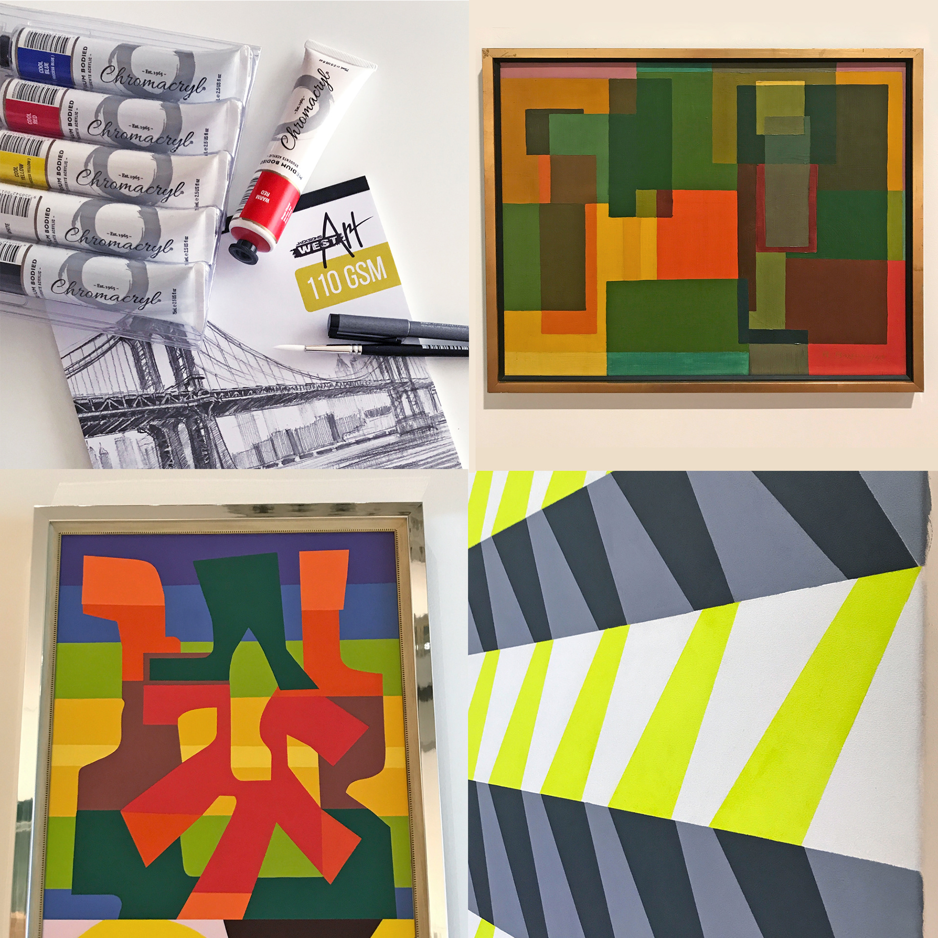
Fired up by the ABC docco, “Finding The Field”, I headed to the nearest art supplies shop to replace my dried up old acrylic paints and crusty brushes. Just walking in the door of those places makes me feel more creative – exploring the latest paints and materials I begin to imagine each tube’s, packet’s and box’s potential – new projects sprouting from my imagination like alfalfa.
The Art Gallery of WA’s not far from there, so spur-of-the-moment I decided to make use of the time left on my parking ticket and pop-in to browse the permanent collections.
In just under an hour I was able to explore most of the four Contemporary works spaces, have a fascinating conversation with a visiting retired QLD art dealer whose life passion is Australia’s Colour Field artists, and quickly whiz around the Modern works on display (from the period 1920–1969). I snapped a whole bunch of things that interested and inspired me, but these ones resonated for the project at hand - my looming Christmas card concept deadline...
(clockwise from top right)
1. Ralph Balson, Construction, 1946
2. Debra Dawes, What’s on your mind? (detail), 2007
3. Diena Georgetti, Cable (detail), 2016
Wherever I go I’m like a bowerbird or crow, collecting images of colourful or patterned objects and storing them away. I have thousands and they just sit there, lining my creative nest until something sparks a memory and I rifle through them for a detail or shape to incorporate into a design.
The latest instance of this was when I was sketching lots of thumbnails to find a combination of joined and intersecting shapes that “clicked” for my Christmas card design this year.
The latest instance of this was when I was sketching lots of thumbnails to find a combination of joined and intersecting shapes that “clicked” for my Christmas card design this year.
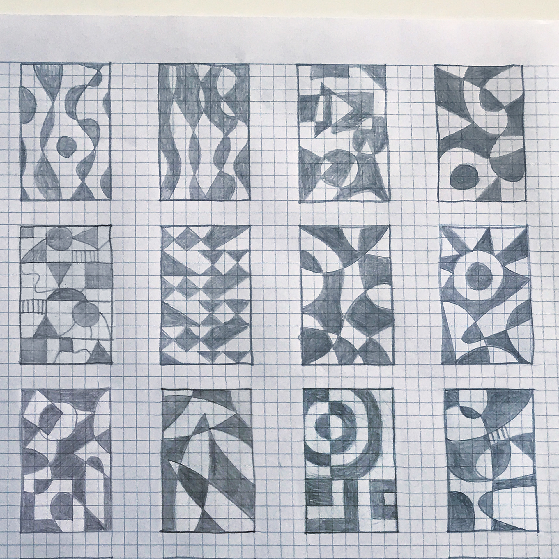
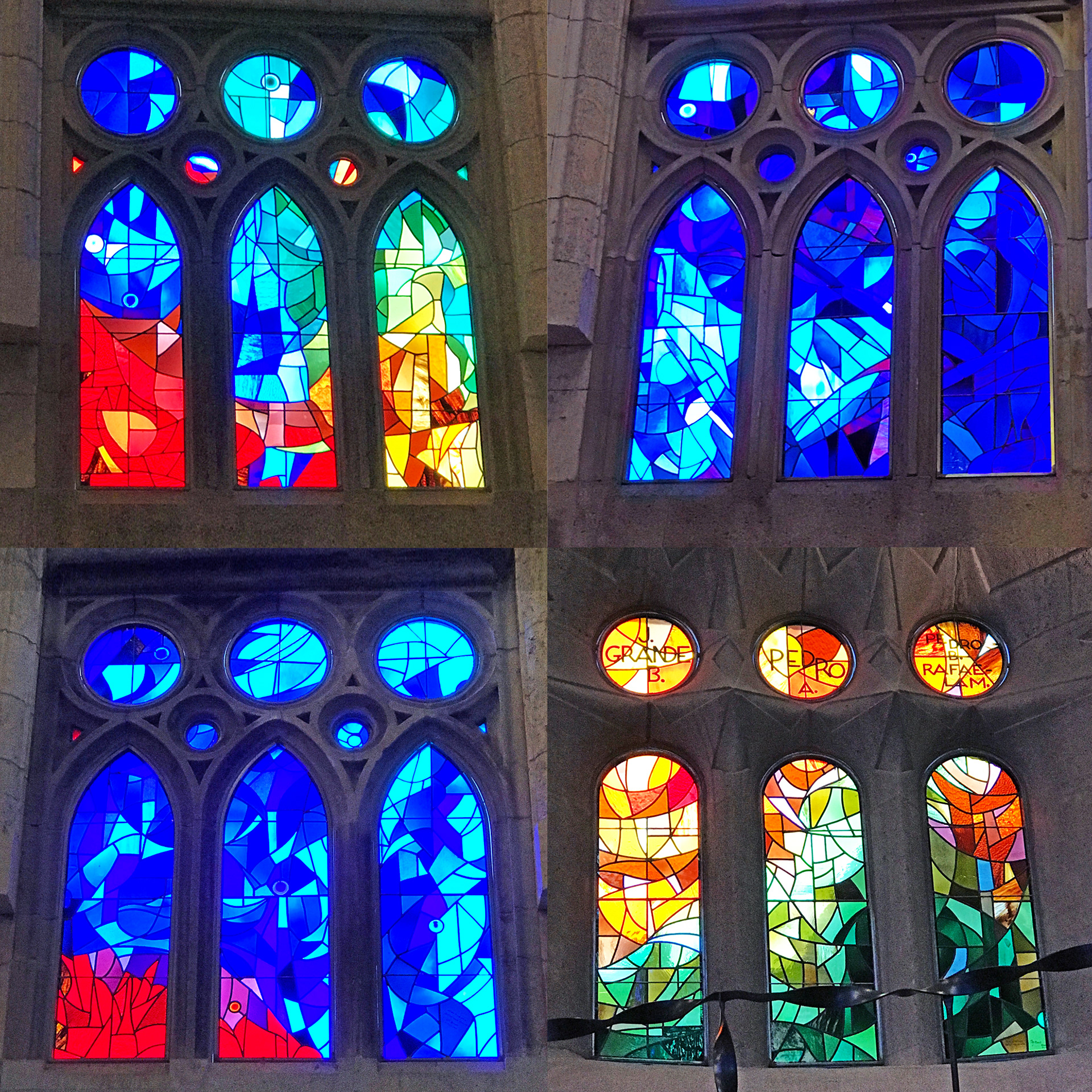
My sketches were definitely informed by the cartoon process I learned about during a stained art glass workshop back in April, and once I started thinking about that, I remembered the amazing windows inside the recently-completed interior of Basílica i Temple Expiatori de la Sagrada Família, Catalan architect Antoni Gaudi’s magnum opus ode to nature in Barcelona.
Snapped back in June 2017, the images I’d stored of the biomorphic shapes and colours within those sublime windows ignited by the afternoon sun now joined the ideas already in my head from watching an art documentary and visiting the Art Gallery of WA.
Snapped back in June 2017, the images I’d stored of the biomorphic shapes and colours within those sublime windows ignited by the afternoon sun now joined the ideas already in my head from watching an art documentary and visiting the Art Gallery of WA.
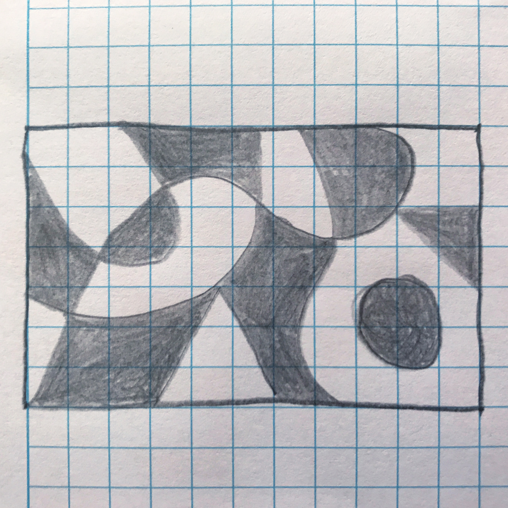
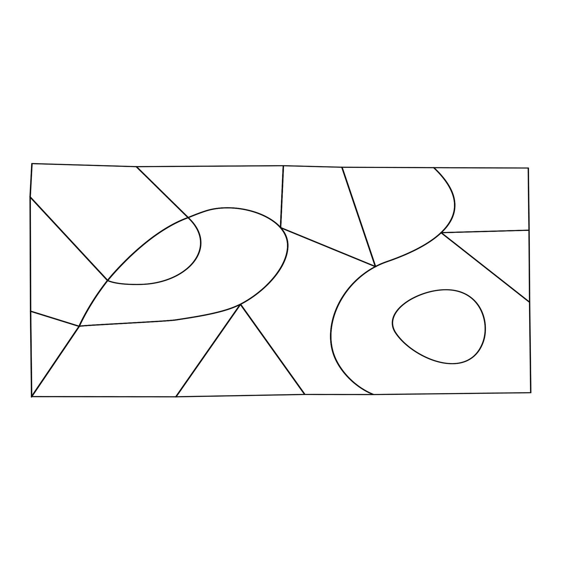
Once I realised my eye was drawn to the top right thumbnail (previous post) as the winning Christmas card design, I scanned it and traced the scan with the pen tool in Illustrator to use as a cartoon (full-scale outline) to first help me figure out colour choice, treatment and placement, and then to transfer onto paper ready to paint.
After 15 years of formal design learning and professional practice I tend to apply the elements and principles of design automatically and intuitively, but it never hurts to refresh and remind yourself, so... The main Elements of Design to consider for any visual project are: line, shape, colour, direction, size and texture. Everything in our highly visual world can be broken down and described in these terms.

Then, in order to convey certain feelings or messages we can use the Principles of Design to help us organise those elements, including: balance, alignment, proximity, contrast, repetition and space.
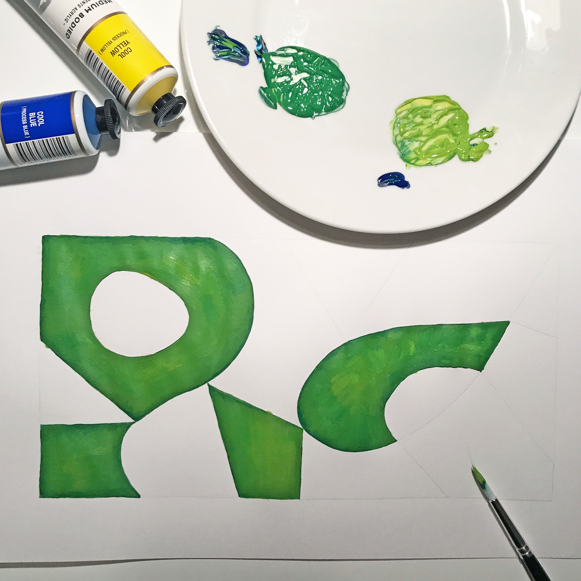

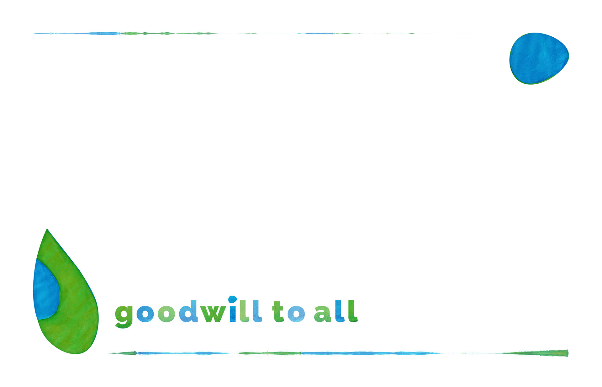
Why blue and green? For it’s freshness and calming effect on the eye, because I’m not a Christmas traditionalist, because they’re the colours of our precarious planet (and allude to the peace on earth I always wish for us all at the end of the year), because somebody said they should never be seen together (and my inner antagonist likes proving rule-makers wrong)… and okay, well my corporate colours are PMS298 and PMS7481 (put simply, I just love that combo). So once I’d mixed my blue and yellow together and painted all the green segments, then done the same with my blue and white paints for the remaining blue bits, I went back to the scanner to bring the finished work into Photoshop to see how it looked with my logo colours.
After a bit of tweaking with Image > Adjust > Colour Balance and then Image > Adjust > Hue/Saturation I had an effect more harmonious with my logo and ready to begin the layout design.
After a bit of tweaking with Image > Adjust > Colour Balance and then Image > Adjust > Hue/Saturation I had an effect more harmonious with my logo and ready to begin the layout design.
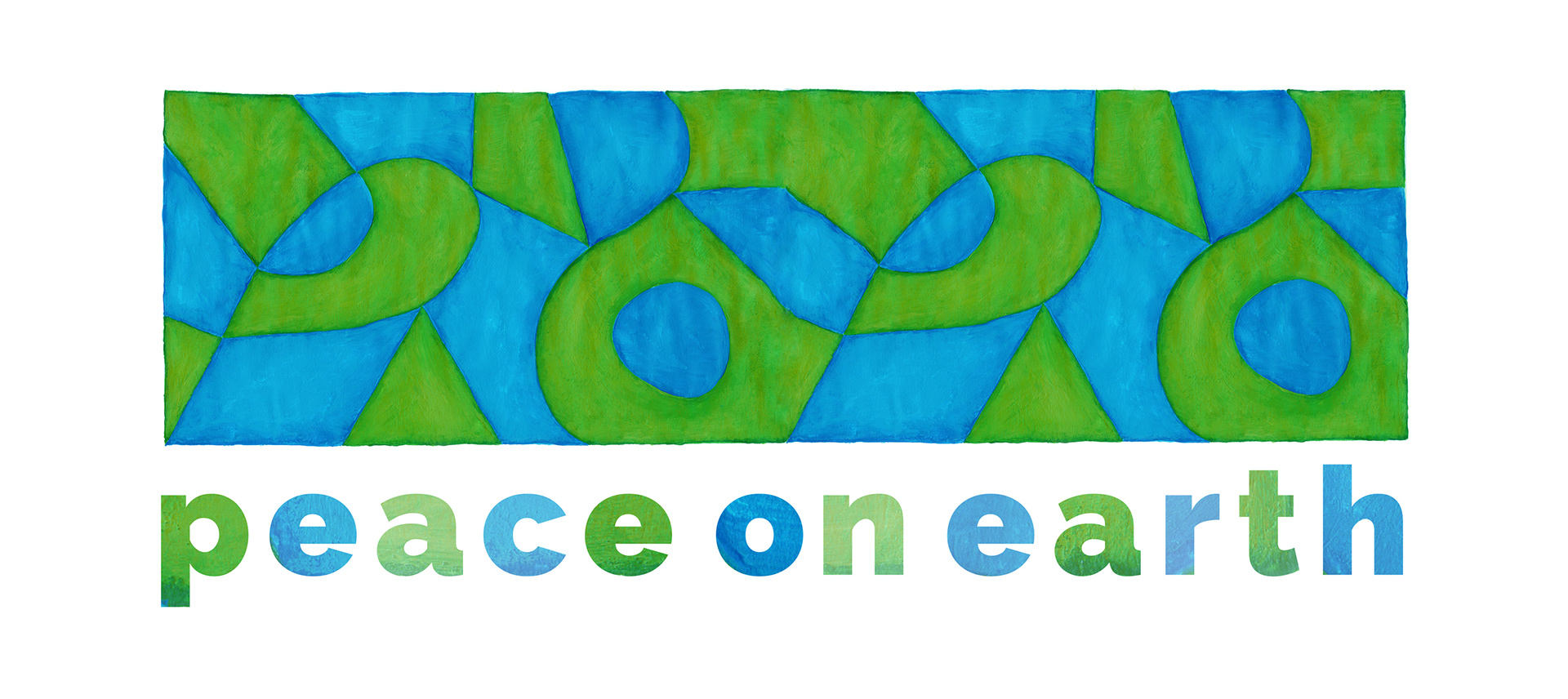
Having already resized (i.e. vertically squashed) my original thumbnail to the desired proportions for the front of the card before painting it, I knew the painting would be featuring as the whole front of my Christmas card this year… but where to place “Peace on Earth”? I tried spanning the message across the entire width at the bottom, then I tried curving the type along the lines within the painting, but I finally settled on it being quite small and off to the right, to let the painting dominate.
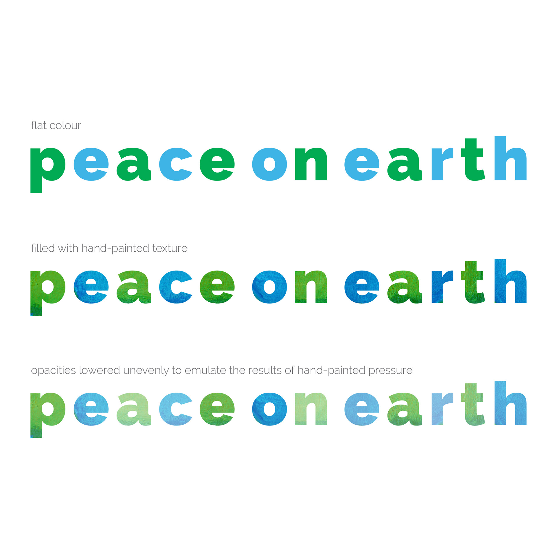
As the painting had been hand-done, flat colour didn’t seem right for the lettering, so I filled each letterform with the painting as well.
Next I lowered the opacity of each letter slightly to create an uneven texture to complement the art above it… et voila!
As the painting had been hand-done, flat colour didn’t seem right for the lettering, so I filled each letterform with the painting as well.
Next I lowered the opacity of each letter slightly to create an uneven texture to complement the art above it… et voila!

A teaser for the year's Christmas card edition
Facebook profile cover image 1
A digital adaption of my painting
Facebook profile cover image 2
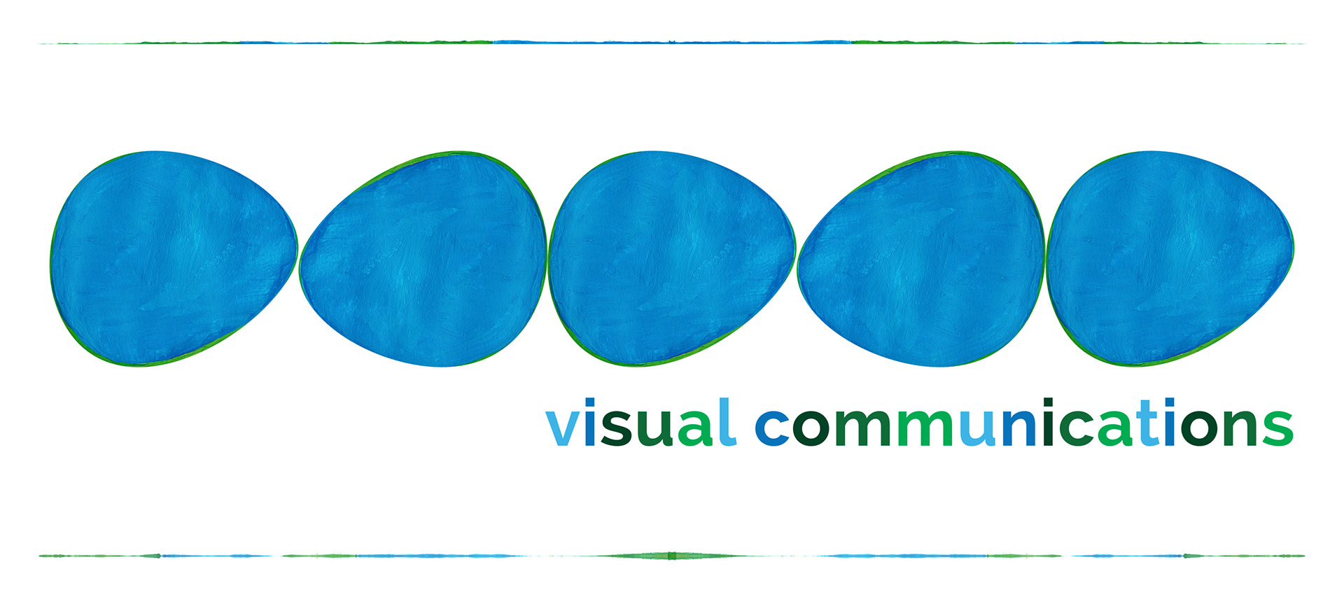
Comprised of graphic clean lines, I was easily able to isolate and adapt different parts of my painting for various social media applications.
Facebook profile cover image 3

Return address labels
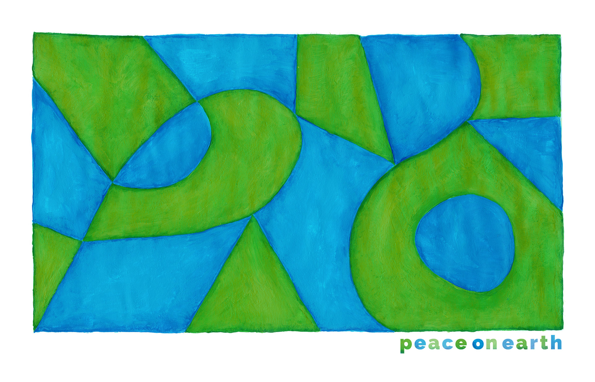
Front of the finished card
Inside of the finished card